Design Isn’t Just Visual:
Showcasing UX writing principles to show how my microcopy guides, informs, and delights users.

Keep it Clear
Guide users through correcting information while maintaining confidence in the workflow.
Scenario:
The user entered the wrong email address to sign in to their account.
Design Process:
I began by researching what happens when I enter an incorrect email into my usual sites - email, social media, banking app, etc. This quickly showed me that prioritizing clarity is key for connecting with the user and keeping them engaged in the login process.
In my first draft I chose to use only label text to express what the user would enter in each field. In user testing, I found it would have been easier if the user could see the label above where they are typing. This led me to adjust my design to include both label and hint text — providing the user with a cleaner, clearer experience.
This final draft prioritizes clarity and ease throughout the user experience. By clarifying that the inline error is the email field and was not found by the system the user saves time in determining their next step. Encouraging them to please try again keeps the user in the experience and reduces the risk of them abandoning the process.
Make it Simple
Focus user’s attention on what matters — taking the next step.
Scenario:
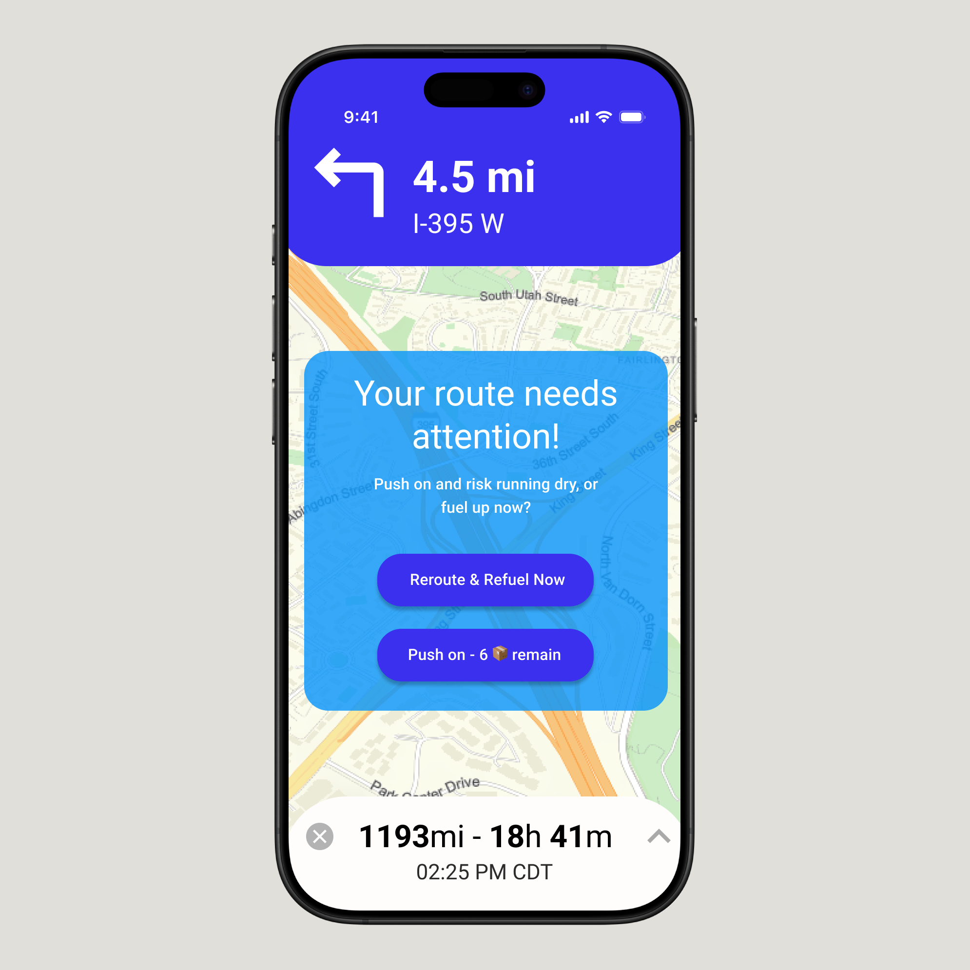
A short-haul truck driver has a phone app that monitors route, schedule, fuel & deliveries.
They have 6 more deliveries before stopping for fuel and lunch. Due to unexpected traffic, they’re behind schedule.
Design Process:
My average trip length is about 3 hours so I needed to understand more of what truckers need while they’re on the road before tackling this design. I spent time reading various online forums learning the proper terminology (fuel or diesel, never gas) and using the most popular navigation apps to get a feel for how this group of users is used to seeing important information while driving.
I determined this needed to be a decision point - the user would have to decide at this crucial point how they would proceed. This means they would need to have all of the relevant information up front and center. In this design I emphasis the route change requirement (else risk running out of fuel) and that the app is here to help — Re-routing means refueling now to get your schedule back on track.
Along the way we do not sacrifice the key points the user needs in the app at that moment. The next direction remains clearly visible and the overall trip length & details are clear along the bottom. This way, if the user cannot make the decision in that moment (perhaps the next turn is just a half mile up the road) they can still navigate properly until they reach a point to safely take the next step.

Expect the Unexpected
Support users when workflows break, crash, and change.
Scenario:
The user works in graphic design. While critiquing a design in a mobile app, their phone abruptly turns off. When they restart the phone, they reopen the app.
Design Process:
To begin, I reviewed several design review sites to understand what type of information would be lost or salvageable after a crash. Many of the sites I reviewed had an auto-save feature of about 2 minutes. Therefore the user would lose some, but not all of their entered information. This is the standard I kept in mind for this design.
Next I thought about the audience - fellow designers. How could they be included in this messaging? Just because this is a necessary error message doesn’t mean they should lose connection to the app itself. I focused on easy, non-jargony language that evokes connection with the design community.
To determine the users next steps I thought about how design reviews often flow. If someone has put a lot of time and effort into writing a critique they may want to start as close to where they left off as possible. On the other hand, an abrupt crash can interrupt a train of thought, so the user should have the option to start fresh.
The result is a simple choice - take whatever was saved and continue on, or start fresh. All while connecting with the user to keep them engaged and excited to resume reviewing designs!


Delight Your Userbase
Leverage feedback to design workflows that enhance users’ lives.
Scenario:
A commuter is trying to find the best route home during heavy traffic. They want to balance spending money on tolls with their time in the car by spending up to $5 on tolls during this single trip.
Design Process:
A common theme amongst navigation apps is customization, but I found a lack of customization options for how much a user is willing to spend on a particular route. While most apps contain the ability to avoid toll roads entirely, few provide the option to use toll roads sparingly. Therefore, I chose to design an addition to a generic navigation application that puts the user back in the driver seat.
I decided to include a “Trip Budget” workflow that emphasizes a monetary limit for a single trip. I then ask the user to set the limit on a sliding scale - providing visual feedback for the increase in budget. The design then asks the user to confirm after clarifying the exact amount that the user permits for toll fees. After confirmation the user is presented with an updated map screen that includes their trip budget as well as which routes fit the requirements laid out by the user.
The result is a updated experience where the user is better informed of their route home options. The user also has control over how much they spend and can make better navigation choices- resulting in a happier commuter.

Emphasize Connection
Meet users on their level, in their own words.
Scenario:
Create a banner screen for a sports application targeting a user who is a working parent and a big sports fan in the midst of their favorite sports season and can no longer attend games.
Design Process:
Life gets busy and often times hobbies fall to the wayside. This design was an opportunity to bring connection back to a user’s life and establish a way to engage in their favorite pastime — without sacrificing time away from family.
The core of this design is the text and messaging itself. By using the terms pre & post-season we tell the user that engaging with this app will give them access to everything in one place, not just main season games. The heavy emphasis of the term “Your” connects the user to the experience and reinforces that this is about what the user themselves can gain from engaging with this experience.
In the final design the call-to-action asks the user to reclaim their time and re-connect with their hobby. It intentionally steers clear of too much user commitment as ideally pricing options would occur on the following screens. The idea is to pull the user into the sign up & purchase workflow while respecting their time and the reasons they’re looking for this connection in the first place — they’re busy.

Brand it— Intentionally
Keep your brand values in focus and design to match.
Scenario:
A user is in their favorite supermarket. They open the supermarket’s app on their phone to see what’s on sale and are greeted by a promotion.
Design Process:
Through this design I sought to maintain brand integrity while persuading the user to try something new — grocery delivery.
First, I spent time studying Lidl’s branding, through their website and their corporate story. What I found was a brand that had two core tenants: quality & affordability (in that order). Everything brought to you by Lidl is curated, but simple. They stock their shelves in manufacturer packaging, even the imported goat cheese. All of their language highlights why their shoppers should trust them. The options on the shelves may be limited, but Lidl has done the work behind the scenes to ensure they are the best options.
This led me to a design that evokes the same - Lidl can do more behind the scenes to curate a better grocery experience for you. Their no-frills approach is seen in the clarity of the message, delivery costs $5/month. They are a hands-on brand, which is shown using terms such as ‘we’, ‘curated’, and ‘by us’.