
How Websites Use Color and Pattern to Be an Invisible Guide

I have a weird soft spot for the DC Metro.
I’ve lived off two different lines now, but there’s just something about the map that I really like a lot. I mean a lot. So much that I did the puzzle. It’s framed and hanging on my wall.
But here’s what that puzzle made me wonder: if you’ve spent your whole life riding BART in San Francisco, and then suddenly you’re dropped into Montreal where everything’s in French… could you still get from point A to B?
I probably have no business asking this question. I live at the very end of the Silver Line and spent most of my life without a single public bus stop nearby. But still…the question sticks.
What makes a metro feel like a metro?
From my limited (but enthusiastic) experience, there are a few things almost every system has in common:
Train cars and platforms
Some kind of gate or ticketing system (if you’ve ever bought a fare card once, you know that in general, you need always have to pay a fare)
Lines and stops identified by a number, letter, or — most often — a color
Those three elements do a lot of heavy lifting. Even when the language changes, those patterns whisper: “You know how this works.”
Same logic, different medium
To test this, I pulled up the websites for London Underground, NYC Subway, and my beloved DC Metro.

London Underground?
Delay notices big and bold, trip planning tools easy to find, color-coded lines by name.
NYC Subway?
Same deal — plan your trip, check service status, delays right up front, color-coded lines.

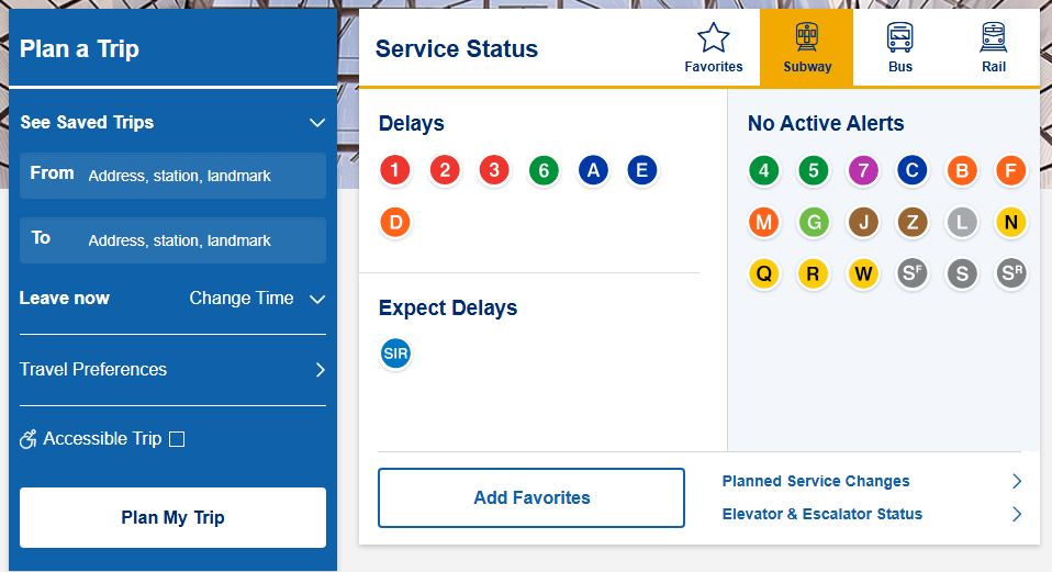
DC Metro?
Delays highlighted on the homepage, trip planner up front, calm background palette with line colors a click away, and a gorgeous station photo because look at it… it’s beautiful.
Already, the pattern’s obvious: color organizes the system, urgent updates are surfaced first, and users are given the tools to plan their route without much effort.
Montreal test drive
Now for the fun part. Montreal’s metro site defaults to French. Let’s say you don’t switch to English. Can you still get around?


Looking at the map, it feels familiar.
Color-coded lines, intersections for transfers. From Parc Jean-Drapeau to Université de Montréal:
Yellow line (Line 4) for one stop
Switch to Orange (Line 2) for six stops
Switch to Blue (Line 5) for six more
Done. Even without the language, it works. Because the design conventions are consistent enough across systems that I can “read” the map without reading the words.
The UX principle hiding here
This is Jakob’s Law in real life: users spend most of their time on other sites, so they expect yours to work the same way.
If I got to a transfer point expecting to change lines but instead was told I needed to exit the station and catch a bus three blocks away? I’d be irritated and lost. Same with websites. Break a convention at the wrong time and you’ll lose people before they even see what’s great about your product.
That’s why:
Navigation should follow established patterns
Content should be grouped where users expect it
Workflows should be consistent and logical
The familiar reduces friction. And the less effort it takes to orient, the more energy users have to engage with whatever new thing you’re offering.
So if you want someone to take a leap with your product, make sure it feels like the natural next step.