
Welcome to ScaleCo: The Capitalist Dungeon Crawler
A narrative-drive tabletop Dungeons & Dragons campaign built with DungeonDraft & Foundry VTT that explores the darkly comedic world of office politics, corporate bureaucracy, and player agency- all through a UX designer’s lens.
Technology Used: DungeonDraft, Foundry VTT, Notion, Canva
Skills Applied: UX writing & narrative design, player behavior research, information architecture, systems thinking, puzzle design & chaos management
The Question:
How do you design a high-stakes, Dungeons & Dragons one-shot that doesn’t feel like a railroad, but still guides players through increasingly complex goals? What if it’s all set in a soul-crushing corporate office?
I set out to create an experience that:
Rewarded curiosity while managing user cognitive load
Encourage decision-making with consequences (good and bad)
Parody office culture just enough while maintaining user buy-in
Balance player agency with structure to ensure users make it to the final boss.
My Approach:
Rather than creating an expansive open world or locking the party in a strict path, I created a flow that mimicked the illusion of choice found in many real-world bureaucracies.
In other words: you can do it your own way… as long as you fill out Form 42-C and a signature from the HR department.
I treated the campaign arc like a user workflow, balancing:
Structure: As you would typically find in an office, each room connects and has a general flow. This keeps users in the workflow and lowered abandonment risk due to an overwhelming number choices.
Player Agency: I maintained several solutions to each progression puzzle and paths to reach the final boss.
Environmental cues: I created visual storytelling elements through flyers & interactive bulletin boards for world-building and providing hints for players to progress in the story.
The Player Experience: User Flow in Fantasy Form
Players are tasked with investigating the newest ScaleCo branch. Profits are off the charts and players need to know why — and see how they can take a piece of the profits for themselves.
Act 1: “You’ll need at least three signatures”
Objective: Gain access to the executive assistant’s office. They control the CEO’s schedule after all.
UX Note: Players could earn access by solving puzzles, roleplaying interactions, or using in-world trivia knowledge. I worked to ensure they felt clever no matter which approach they took.
Shown here: (Left) Office cubicles filled with busy workers or procrastination experts. (Right) Department Head desks and managerial offices.
Act 2: Get on the calendar!
Objective: Work with (or against) the executive assistants’ policy to secure a meeting with the CEO.
UX Note: This portion tested how well players were picking up on cues and tools I’d laid out in Act 1 (flyers, NPC dialogue, forms).
Mechanics: Players could choose to follow the policy directly or cleverly workaround the system to proceed.


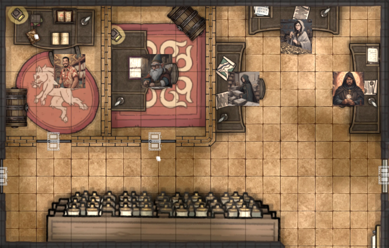
Shown here: (Left) The executive assistant’s office — Ms. Lucinda Goldleaf (Right) A regular conference room whose chairs definitely “won’t” kill you.
Act 3: Meet the “Boss”
Plot Twist: The CEO isn’t really in charge…
Decision Point: Players must align with him, fight him, or bypass him. Either way, they have to find out who is really in charge.


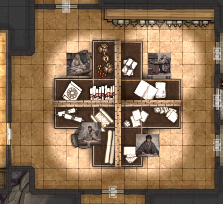
Shown here: (Left) The CEO’s private chambers. (Right) A ledger players can find before (or after) dealing with the CEO.
Act 4: The Reveal
Objective: Survive meeting the real boss - The Chairman of the Board.
UX Note: This delayed reveal of the true “villain” rewards players for remaining in the workflow and still retains player agency as they choose their next move based on their particular playstyle.


Shown here: (Left) The chairman’s chair. built on the bones of former employees. (Right) The shareholder sword - Wield the sword, wield the profits.
UX Design in Disguise
At first glance, this may look like a tabletop roleplaying campaign, but underneath the fantasy is a fully designed user experience. From onboarding mechanics to environmental storytelling, I applied UX principles to guide players through a complex, interactive world. Every puzzle, flyer, and form was crafted with the user in mind.
System Usability: Form Verifications & Signatures
Each locked doors required a specific number of completed and/or signed forms.
Forms could be “signed” at the cost of a task or damage or bypassed by passing a particular skill check.
This allowed players to choose friction (speed vs. strategy).


Shown Here: (Left) Example of a employee bulletin board notice. (Right) In addition to world flavor the flyers also provide hints on directions players can take to progress: Access to the executive wing may lie with the Assistant to the General Manager.
UX Parallels & Professional Takeaways
This project not only stretched my design-thinking skills but also showed me that good UX matters and must be considered when aiming for an amazing user experience.
User Behavior Matters: I respected what players responded to, and adjusted the environment accordingly. Inserting tutorial cues can lead to excitement in delight as users inspect the rest of the interactive interface.
Information architecture is storytelling: The flyers, room layouts, form text weren’t just about adding flavor. They reinforced the world’s logic and kept players immersed.
If you can make people care about fake office politics, you can design for anything: This project reminded me that storytelling, interactivity, and emotional payoff are, at their core, elements of usability.